Premium, not pompous
01We sound expensive because we are precise, not because we use big words.
- We say
- “We architect premium visual identities.”
- Not
- “Best-in-class, synergistic, world-class solutions.”
Tenbo Labs.
How Tenbō Labs looks, sounds and shows up. The system behind every identity, film and post we put into the world.
01 Essence
Everything in this book comes back to one idea: founders deserve a presence as ambitious as their vision.
Tenbō Labs is a premium branding and content agency. We architect visual identities and high-impact content strategies for founders who demand excellence, and turn their vision into market-leading authority.
The name
展望
Tenbō noun
Japanese for “outlook”, the view from higher ground. We help founders see further, then make sure the market sees them.
Visual identities with a point of view, built to be recognised at a glance and remembered long after.
Story-led films, design and social, engineered for attention and built to hold it.
Consistency compounds. We turn presence into trust, and trust into market position.
02 Voice
Our words carry the same weight as our visuals. Four traits keep every caption, proposal and post on-brand.
We sound expensive because we are precise, not because we use big words.
Short, declarative lines. We state it once and let the work back it up.
Get to the point. Founders are busy, so every sentence has to earn its place.
We write to one ambitious person, not to a market segment.
Tenbō Labs in sentences, macron included. TENBO LABS. only as the Anton wordmark. Never TenboLabs or TBL.
UPPERCASE for headlines, buttons and labels. Sentence case for everything people read.
Lead with numbers, not adjectives. “465K+ views in 30 days”, not “massive reach”.
03 Logo
A confident geometric wordmark with one detail that matters: the macron over the ō. Never redraw it. Always start from the supplied files.


Digital wordmark
Live Anton text for navigation and footers, where the full logo would be too fine.
Clear space
Keep x, the cap height of LABS, clear on every side. The supplied files already include it.
Minimum size
96 px wide on screen, 25 mm in print. Smaller than that, use the kitsune.
04 Logo usage
Four approved versions cover every background. Pick the one with the strongest contrast, then leave it alone.
Primary
Cream and light backgrounds
Reverse
Dark Purple backgrounds

Mono dark
Single-colour print, light fills

Mono white
Photography and video
05 Kitsune
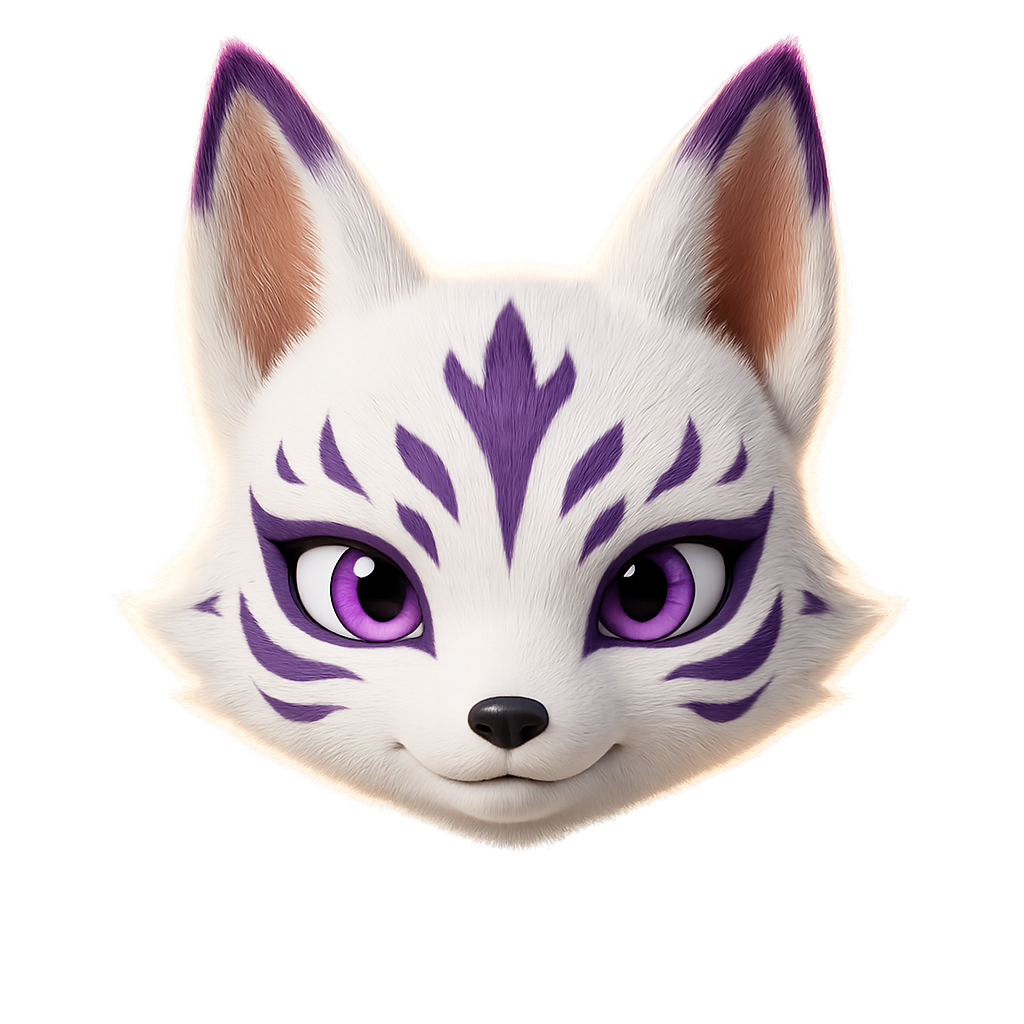
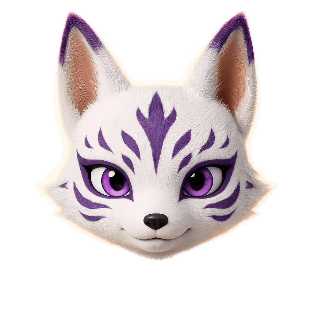
Our mascot and secondary mark. It brings warmth where the wordmark would feel formal: app icons, avatars, stickers and small moments of delight.
In Japanese folklore the kitsune is a fox of uncommon intelligence that grows wiser, and changes form, with age. Ours is the face of Tenbō Labs: sharp, a little playful and always watching the horizon.
06 Colour
Four colours in fixed proportions. Cream leads, Dark Purple anchors, Light Purple and Gold are the spice.
Cream
60%
The default background. Warm, quiet and roomy, so the purple can do the talking.
Dark Purple
30%
Headlines, body copy, primary buttons and full-bleed dark sections.
Light Purple
8%
Accent words in headlines, hover states, highlights and the LABS in our wordmark.
Gold
2%
Rules, dots and small moments of distinction. A little goes a long way.
5%
10%
20%
40%
60%
70%
100%
5–10% for borders and fills. 40–70% for secondary text.
AAA
Body copy and headlines
AAA
Reversed text
AA
Accents on dark
AAA
Signals on dark
AA
Text on accent fills
Decorative only
Oversized display accents only
07 Typography
Two families, two jobs. Anton speaks up, Inter does the work. Both are free on Google Fonts.
Aa
Headlines and numbers
Regular 400. Always uppercase, tracking −0.05em, leading 0.85.
Aa
Body and interface
400, 500 and 700. Body copy, buttons and the uppercase micro-labels.
08 Elements
The small, repeatable pieces that make a page feel like ours: pill buttons, quiet labels, big numbers and a hint of gold.
Full pill, Inter Bold 14, +0.1em, uppercase. Dark Purple fill turns Light Purple on hover.
Sits above headlines. 20% Dark Purple border on a 5% fill.
465K+
Views in 30 days
4,700
Followers gained
Anton numbers over Inter labels. Proof first, always.
A 2 px rule at 60% and a 10 px dot. One gold moment per view, no more.
Soft radial glows of Light Purple (30%) and Gold (20%). Backgrounds only, never behind body copy.
Pills for actions, 16–24 px radius for cards and media, circles for people.
09 Applications
How the system comes together on the surfaces people actually see.
tenbolabs
Premium branding & content agency. Building authorities.
labstenbo.com
Name Surname
Founder
labstenbo.com
@tenbolabs
Elevate your presence
465K+
Views in 30 days
Let's build.
10 Downloads
Everything you need to build with the brand. If something is missing, ask us before you improvise.
This guide as an A4 landscape PDF · 1.6 MB.
labstenbo.com/brand/tenbo-labs-brand-book.pdf
Logos, kitsune, colour tokens and this PDF in one folder · 3.0 MB.
labstenbo.com/brand/tenbo-labs-brand-kit.zip